


Product Feature Page Redesign
https://www.localytics.com/features/
Localytics asked me to do a complete redesign of the Product Feature Page experience for their website. Their main issue with the current site is that it lacks hierarchy and is extremely dense with information. They asked me to find away to display our products in a visually compelling manner that would improve drop off rates.
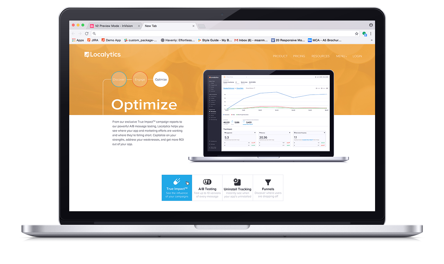
The products are separated into three product buckets, Discover, Engage, and Optimize. I wanted to find a way to make these products more discoverable and to make it easier for users to navigate through the various sections with ease. Upon clicking onto the page there is an animation that I created in Adobe After Effects that shows that while our products fall into three separate categories, those categories combined create one cohesive all-encompassing experience.
Upon hovering over each product bucket, the various products that exist within that bucket appear beneath the graphic so that users have a better idea of what they will find when they click through.
Depending on which bucket you choose, the user will be taken to the subpage for that specific bucket. Each subpage for the various buckets contains two sub-navigations: one that allows you to easily navigate back and forth through the different product buckets, and another that contains the various products within that bucket. On hover, the product nav will change the graphic displayed on the computer screen to reflect how that product looks on our dashboard. If you click it it will take you to a page that describes that product in greater detail.
We A/B tested my redesign against the old design and found that the new design performed 95% better than the former in driving sub-page views, 50% better in content conversions, and drove 80% more leads (demos requested.)